Peter Kirby wrote:Are you sure you completely understand all that you are saying?
Not 100%. It's been well over 40 years since I did university level statistical mathematics.
And do you understand what I've been saying in reply?
Kind of. I can see you have a point about what to do with the outlying results.
You make this clear in the exercise below.
I can create a proper graph later, concerning what you are interested in, if you would have any interest.
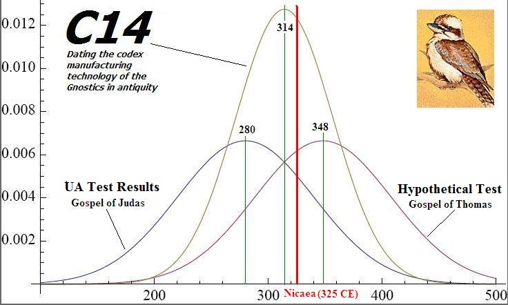
OK. Sure I am interested. The whole thing was the ability to depict not just one, but a series of C14 results (obviously for the same category of evidence)
Perhaps another dialectical exercise will show why the original graph's third curve is misguided/irrelevant.
Suppose we have 2 initial curves with 4sigma (practically almost 100%) intervals of 250 to 450 and of 500 to 700 respectively.
Your multiplication would leave no area under the resultant curve, or it would take miniscule overlap around 475 and represent that as the highest point on the curve when in fact it should be low since it is outside both initial curves with over 99.9% confidence.
Do you see?
Well your example makes it pretty clear there is a problem when the distributions are as disjoint as that.
While this is a valid comment, I kind of expected that the range of all the distributions would not be disjoint. (Because of the nature of the Age curve)
NB: Your example = 2 initial curves with 4sigma. But is this the sigma of radiocarbon age curve?
Someone misguided you if someone said that this was the appropriate math for what you want.
It is more likely that my input specifications were inappropriate for the someone who prepared the graph.
Here is the posts with the specifications used in the graph.
You can see from this that the 3rd curve reflects the probability that both documents were produced in a 20 years span centered on that date.
The 20 years looks a bit arbitrary.
http://talkrational.org/showpost.php?p= ... stcount=82
cold one wrote:
OK, I made a graph of this. Here it is. The blue and red curves are normal distributions centered on the dates you gave, with standard deviation 60 years. The value of the brown curve at a given date is the probability that both documents were produced in a 20 years span centered on that date. For example, at 300 it's .013, which means there's a 1.3% change that both documents were produced in the period 290-310.
Please be aware that the units of the brown curve (probability) are NOT the same as the units of the blue and red curves (probability density). Really they shouldn't be plotted on the same graph. If you integrate the blue and red curves over some date range you get the probability that document was produced in that range. If you integrate the brown curve, you get crap (it's already integrated).
You could pick something other than a 20 year interval. If you pick a very short interval the brown curve has more or less the same shape, but its amplitude (peak value) gets very small. If you pick a large range the peak value goes close to 1 and it becomes very broad (nearly just a straight line at 1). If you think about it you can see why.
Instead you might want to see a plot of the probability that both documents were produced within some time of the midpoint between 290 and 348 (in other words a plot of the peak value of the brown curve as a function of the range). I can make that one too if you ask nicely. I expect it will be 70% when the range is about 200 years, 90% if it's 300.
So there may be a better and more natural way to graphically present a probability curve for multiple C14 dates. IT HAS NOT BEEN DONE BEFORE AFAIK. That does not mean that the principle behind it is illogical or invalid. Quite obviously the test material must be of the same category in order to make a valid comparison.
It may even be preferable to use as input data the results of the calibrated date range. The whole point of the exercise was to derive some sort of [valid] probability curve that combines the results of n C14 tests results (where n>1). The idea is that one [valid] picture is worth a thousand words. The focus here was on the manufacture of Coptic codices in antiquity.
So of course I would be interested to explore this further. In time. And also of course, to better understand the specifications of how to "combine" two (or more) C14 distributions (either prior to or after calibration). Whether such a specification is valid, and what may be interpreted from it. etc.
LC